Simple Styling Tips from Dulcet Creative
Hey Est. California Readers!
Amber and Kayla here of Dulcet Creative! We are here today excited to teach you a few simple styling tips that we’ve learned this year that we hope will help you with styling your images. Styling is a tool with unlimited possibilities. If you’re a business you can use these tips to help you create a cohesive visual presence and help people to get to know you and your products better. If this is your first time souping up a shot, this will guide you through. In time, you’ll get faster and more daring as your styling mind develops! The end result will be beautiful, creative photos that not only showcase YOU, but also provide attention-grabbing images to show off in blogs, social media, newsletters or anywhere you find a promotional photo op!
#1. Choose your colors:
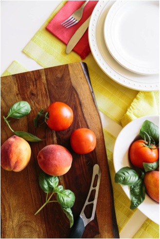
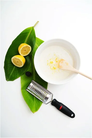
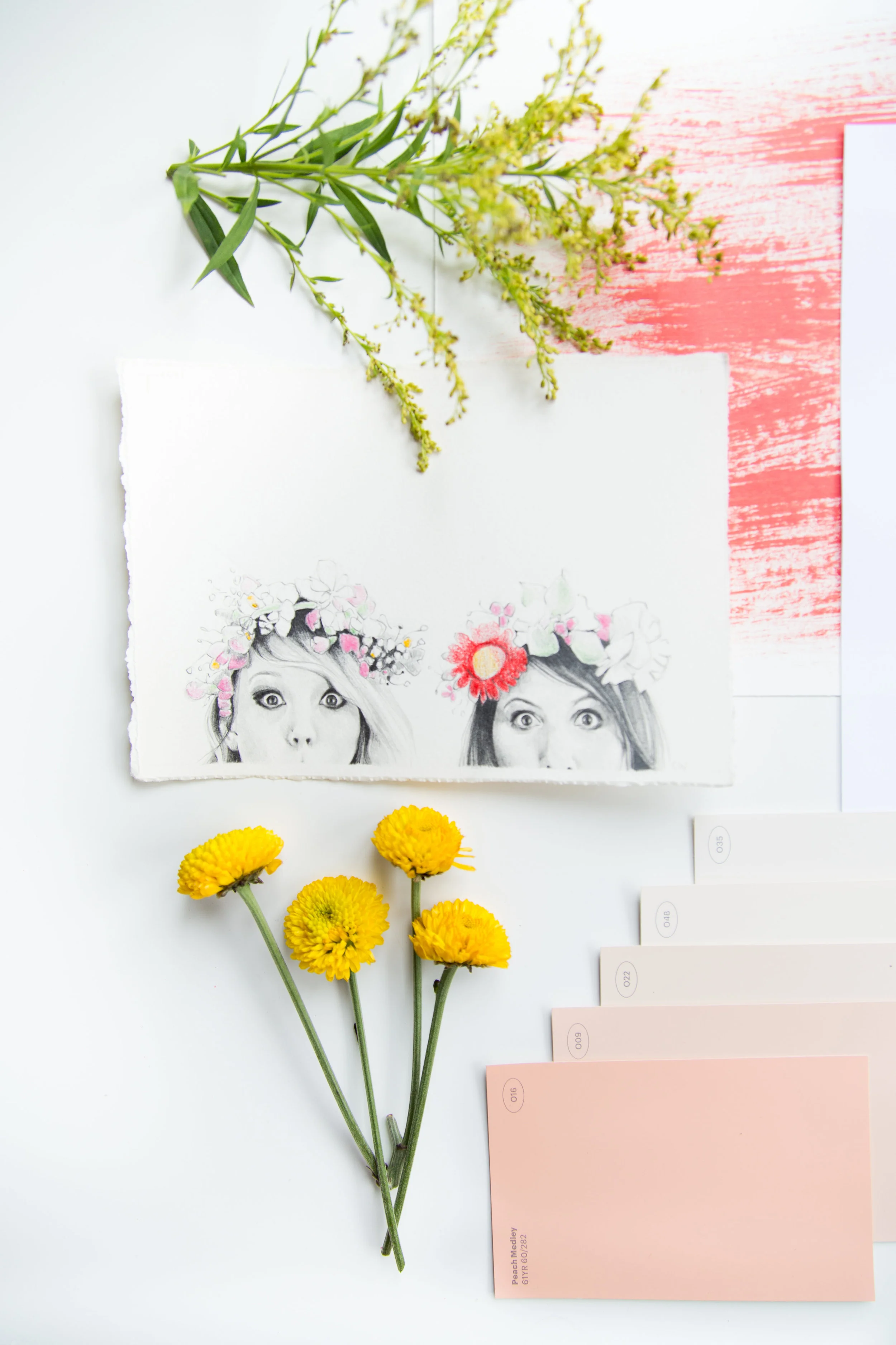
Choose one or two colors to weave through your scene in order to keep a cohesive visual harmony throughout your image. Choose your colors according to the message you want to convey. If you’re looking to create a fun, summer look, then use pops of bold color here and there to make a statement and use neutral colors for a more mellow, understated look. While there are times when all white on white can be visually striking, it is also fun to look for backgrounds that create contrast. So a pale colored food and plate gets a dark background whereas a vibrantly colored dish tends to be best with a simple white background.
#2. Keep it fresh:
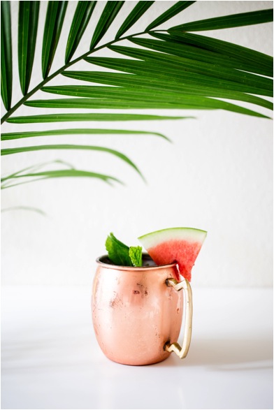
You will rarely ever see a scene that we’ve styled without some kind of fresh element like fruit or greenery. Adding those pops of flowers or plants will breathe life into your images.
#3. Liven things up
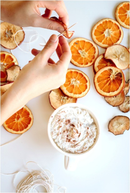
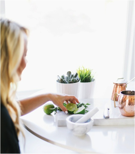
Get a few work-in-progress shots. Bringing hands into your scene will add a human element that makes things more personal and real.
#4. Create Balance
Start simple and add more props for complexity. Play around with different lines, varieties of dark and light colors, lights and shadows, and so on until you find what you like. Your main focus will be to balance the different elements in order to create a pleasing aesthetic to the eye while keeping everything consistent with your brand and products. As always, trust your judgment and continue to step back and reassess to continually get a sense of what emotion you are looking to evoke.
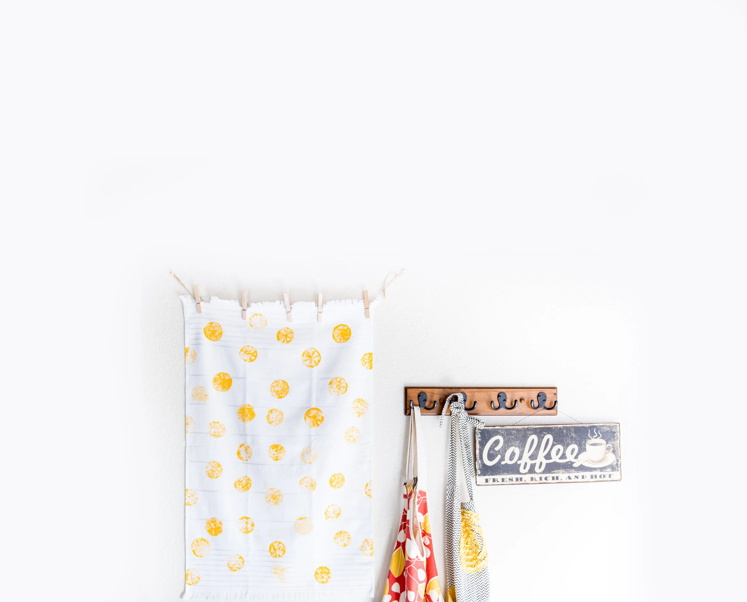
Don’t be afraid to play around with white space. Set your props around the edges, or corners of your picture. This comes in handy if you ever put text over your images for website or blog purposes.


